Brand identity design helps you guide how consumers perceive your business.
How people perceive your business, if they will buy from you, and how much they will spend is all influenced by brand identity.
We make conscious choices every day how we’re perceived by others, a business can do the same thing.
Because a business is a larger consolidation of people there has to be planning and documentation that goes into brand identity design.
Ideally, it all comes down to having brand recognition which means people know exactly who you are and what you do just by seeing your logo or hearing your company name.
Being aware of how brand design works and what’s involved is the first steps in designing your business’s brand identity as you build it.
Professionalism is about being consistent in your brand. Share on XBuilding a good brand identity for your business will help you grow in the long run.
Just as there’s a lot more to you than just your face, a brand identity goes deep into the interworking of how your business presents itself to customers.
Before getting into the details it’s good to know exactly what brand identity is.
What is a brand identity?
According to Investopedia, a brand identity is “how that business wants to be perceived by consumers.”
Brand identity design is the thoughtful design of putting various elements of the business together to “reflect the value the company is trying to bring to the market and to appeal to its customers.”
In other words, brand identity comes down to how a company wants to be perceived by its customers and all the different elements that go into that goal.
Design is the intentional creation of something and in this case brand identity.
If brand identity is how a company wants to be perceived then there are many elements that make up a brand identity.
What makes up brand identity design?
Every part of your business that a customer sees or hears is part of your brand identity.
All those parts such as your logo, name, value proposition, and even font make up how your customers see you.
The brand identity can evoke emotions in customers from optimism to peaceful and everything in between.
It’s impossible to cover every part of a business that makes up a brand identity but there are some very common ones.
I’ll stick to the most common because every business should focus on them in brand identity design and every brand guidelines document covers them.
Each element makes up how a brand is perceived and are essential to a business brand identity.
We’ll start with the logo because it’s often the first thing seen.
Logo
The first impression of most businesses is the logo. Even if it’s not the very first then people are likely to see it soon after they meet you.
People see your logo on business cards, advertisements, directory websites, and of course your website.
A logo will tell your company story at a glance in a visual form that people process instantly.
A company logo sets the stage for how the company is seen by consumers. Share on XA logo should tell the story of a company in design, colors, and emotion. We recently designed a logo for a winery and it tells the story of the family who has run it for over 40 years.
One of the essential parts of any brand identity design is the logo.
I’ve written about the importance of having a quality small business logo and the pitfalls of having a cheap logo designed.
That’s for good reason.
You don’t want to have your business based off of a generic cookie cutter logo that doesn’t say much about your business.
Though the logo isn’t one of the basics of brand identity design, it is at the core.
Some of the basics are just as important though because they help make up things like your logo.
Colors
At the core of brand identity design is colors.
Colors tell a lot about your brand and are at the root of how people interpret your company.
Each color tells a different story and has a unique core meaning.
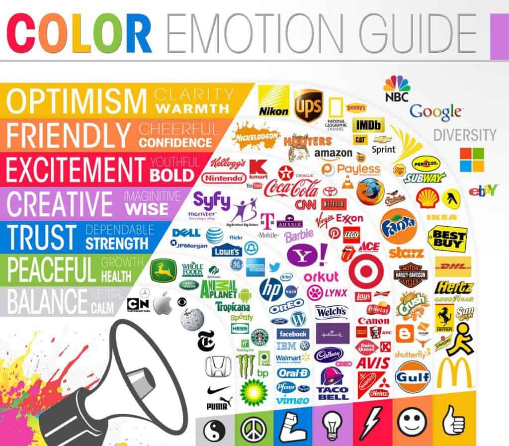
This color emotion guide from The Logo Company shows how each color emotionally can affect us.

Of course, there are more detailed breakdowns of each color through which an article from Canva covers well about the meaning and symbolism of colors.
Here’s how Canva breaks down the colors:
- Red – danger, passion, excitement, and energy.
- Orange – fresh, youthful, creative, and adventurous.
- Yellow – optimistic, cheerful, playful, and happy.
- Green – natural, vitality, prestige, and wealth.
- Blue – communicative, trustworthy, calming, and depressed.
- Purple – royalty, majesty, spiritual, and mysterious.
- Brown – organic, wholesome, simple, and honest.
- Pink – feminine, sentimental, romantic, and exciting.
- Black – sophisticated, formal, luxurious, and sorrowful.
- White – purity, simplicity, innocence, and minimalism.
- Multicolor – variety.
That’s a little more detailed but there are so many different colors it’s impossible to cover them all.
You can find research on more colors to find a color that’s perfect for you.
With the perfect core color, you have your core palette which will have all your secondary colors.
The color you choose will represent your brand and convey unspoken meaning. Do it thoughtfully.
Next up is the personality or tone of your brand.
Font
There can be a whole story behind the font you choose. Font choices aren’t just about personal preference and what you as the business owner like.
Font types tell a story and have subtle influences on how consumers interpret your business.
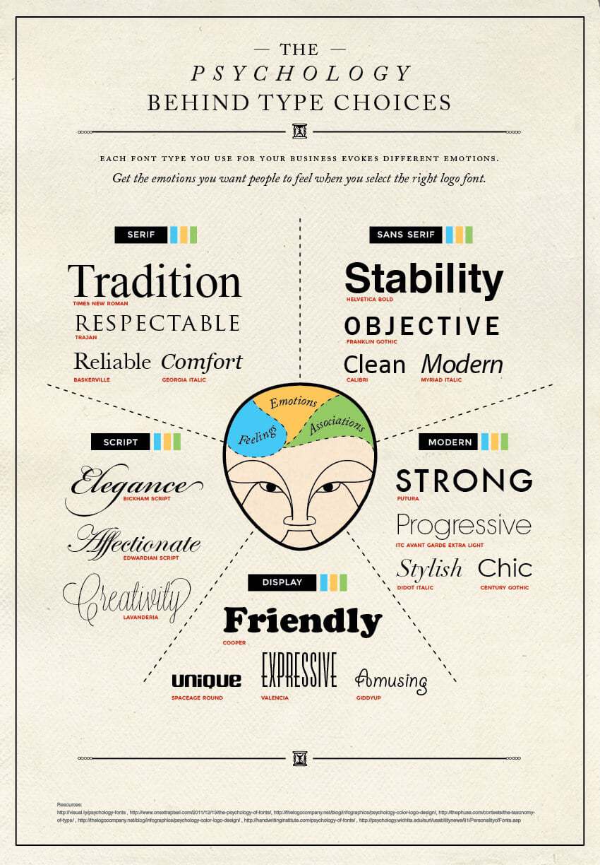
There’s always the traditional serif vs sans serif and then there are other variations too.
Take a look at this infographic lots of different options and what they mean to your brand identity.
You’ll find a lot of tech brands using sans serif fonts while many traditional brands use serif fonts.
What mood and feeling are you trying to show your customers?
The font you choose also plays a part in the overall personality and tone of your business.
Personality/Tone
The personality and tone of your business are immediately noticeable by consumers.
They’ll notice the language you use whether it’s conscious or subconscious.
The language used to convey additional personality and tone beyond the colors and logo should be consistent.
If your colors and logo say optimism then your language better say optimism too.
Balance
I want to take a specific look at a company and how they’ve combined some of these elements together that are consistent all around.
Apple is a great example of a company which prides itself in balance and stability.
The logo conveys balance and stability both in the name and visual.
Take that a bit further by looking at Apple’s website and you’ll notice a common theme.
It’s calm and stable with a lot of colors that match it slogo. This carries their goal throughout the company brand identity.
When you watch any Apple video from Johny Ive the whole thing conveys a sense of calm stability which is why he’s their ideal spokesman.
Excitement
Another company that does it well combining many different elements is Nike.
The color focus of Nike used to be red which is more exciting and bold but as they’ve matured they’ve moved more towards black.
Their website now consists of almost entirely black which plays more to luxurious and sophisticated.
Nike does still do a good job of combining the personality of bold and exciting with the luxurious and sophistication though.
Pictures are an important and dominating feature of any brand identity.
Pictures
People focus on pictures and process them fast. They’re also a very noticeable part of brand identity design.
Again all pictures should stay consistent in design and focus sticking with the one idea you’re trying to convey with your business brand identity.
Internal brand guidelines for major companies have sections that cover the types of pictures to be used.
If you’re a medical company then you’re probably trying to represent your company in pictures that are
- calming
- uplifting
- professional
- experienced

If you’re a recruiting company that works in the accounting world then your pictures are going to focus on
- formal business
- happy professionals
- friendly business meetings
and the list goes on.
Sometimes a silly brand identity is called for in which case that should flow throughout all places a consumer could experience your company.
You might use illustrations that have a playful feel to them even.
A good brand identity design takes a lot of moving parts into consideration but it all requires planning.
Plan Your Brand Identity
No matter what you choose as your main brand identity, brand identity design will help you make it consistent throughout your company.
Planning your business and how people should see you will help build trust in your company. If you’re consistent, stable in your message, and do it well then your company will be memorable. Even your email address can play a part in your branding.
Professionalism isn’t about being official, proper, and corporate-like. Professionalism is about being consistent in your brand.
Many small businesses are all over the place on their branding. Having your brand identity together and consistent will make you stand out as unique.
Once you have a good plan in place for your brand identity you need to make sure that message gets out there.
A good website will help your business get out there in front of customers.

