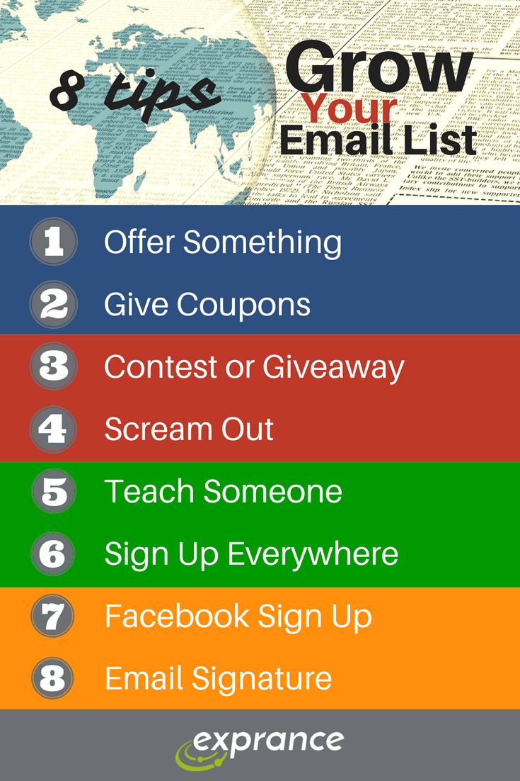
Growing your email list is important to your business growth online. I briefly covered 8 great tips to grow your email list. Now it’s time to cover in more detail how you can scream out at your visitors without actually screaming at them :)
When someone visits your website they’re often focused on whatever it is they’re trying to do or find. Either that or they’re focused on whatever interests them at the moment. Your visitor’s attention rarely aligns with the goal of your website, though. Because there’s rarely any alignment of goals, you have work to do.
Your website has two jobs in terms of the blog:
- Visitor: It must deliver value to your visitor whether it provides information they’re looking for or entertains them.
- You: Provide a lead or some sort of value to your business.
Neither of these two jobs are easy, but the first one is beyond the topic of this post. The topic of this post is to help you take advantage of the traffic you bring to your website by increasing the chances visitors will become leads. In other words, the goal is to get them signed up for your email list, or at least not waste the opportunity to get them into your list.
You won’t get a customer, but you will get a qualified lead that you can build into a customer over time.
Make sure you put an email list sign up form in these 4 locations of your website and blog to increase the chance your visitors will convert into an email list subscriber.
Blog Sidebar
If your blog has a sidebar, take advantage of it. Before your visitor sees anything else in the sidebar on any blog page, it should be an email list sign-up form.
While this may not be the most common place a visitor will sign up for your email list from, it will make your email list sign-up more obvious. You may be tempted to put something else in the first place on the sidebar, but don’t. Push it down a bit and put a subscription form at the top. The first place will get the most attention on your sidebar, that’s valuable, use it for something good.
End of Post
Each post on your blog needs a call-to-action. That means you want to ask your readers to do something or offer them something special to entice a subscription.
Including an end of post sign-up form provides a natural flow from your post into an action the reader can take to get more. This is one more place visitors will run across your email list sign-up, increasing the chance they’ll do it.
Bottom of Website
At the bottom of each page, you probably have some navigation links, perhaps some information about your business location. There’s one thing you can’t forget to include, you guessed it, an email sign-up form.
The bottom of your website is just as important as the end of post sign-up form. It’s just as important because unlike the end of post form, the bottom of your website is on every page, not just blog posts. Many people will check out the bottom of a website for important contact information or company details. It’s also a place you want them to run across your email list sign-up.
Over The Top
I say over the top because a must for your website is a pop-up or slide-up. If you’re viewing this post on the website, you might have noticed the pop-up, and closed it. It will get closed most of the time, but it’s a great reminder for visitors without being too intrusive. Just be careful to balance the usefulness with the intrusiveness because some pop-ups can adversely affect your website, a bit no-no.
The goal with a pop-up and slide-up is not to force people to jump through hoops to see your content, they’ll definitely not sign up then and you won’t have the opportunity to strengthen your brand. The goal is to remind visitors that you have a newsletter and you want them to receive your awesome content.
Recap
While these methods might not get you a huge conversion from visitors to email list sign-ups, they will increase your chances. When visitors first see your website (probably not from your home page) they’ll start encountering your email list sign-up at the top of blog posts.
From the top down to the bottom there should be planned encounters with your sign-up form. While some claim the pop-up and slide-up are the most annoying, they’ll probably also be your highest converting which is a good email marketing strategy.
In case you missed all 8 great tips to grow your email list, check out the infographic below and combine them all for some email list growth therapy.
